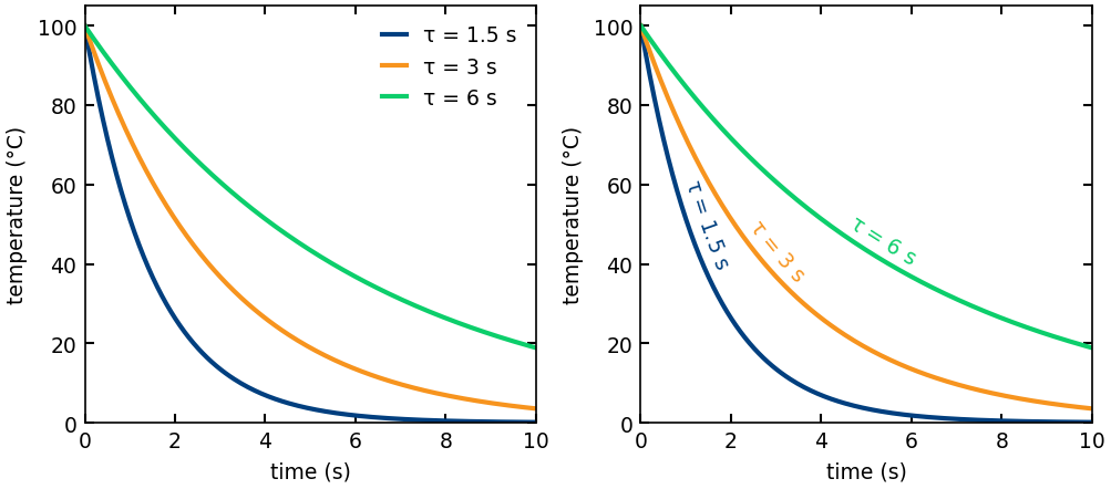
When a chart has a few lines on it, the usual way to tell them apart is a legend: a small box off to the side that maps each color to a name. It works, but it makes the reader do extra work. Your eye lands on a line, jumps to the legend, finds the matching color, reads the name, then jumps back. For every line, every time.
Tufte‘s advice is to put the label on the data instead. Write each name right along the line it belongs to. No color key, no round trip.
I wanted to do that in matplotlib, and there was no simple built-in way to run text along a curved line, so I wrote a small library for it called curved-text.
It draws a string along any (x, y) curve, one character at a time, with each character rotated to follow the local slope. You give it the curve, the text, and three placement controls:
pos: where along the curve the label sits, as a fraction from start (0) to end (1)anchor: whether that point is the start, center, or end of the label.offset: how far to lift the text off the line, perpendicular to it.
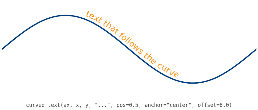
The layout is recomputed every time the figure draws, so the label stays glued to the curve when you resize the window or pan and zoom. It works on anything that draws on matplotlib, including seaborn and pandas plots.
pip install curved-text
The code is on GitHub with a gallery of examples, and it is MIT licensed. If you find it useful, or it breaks on something, let me know.
